变体网格
Variant Grid
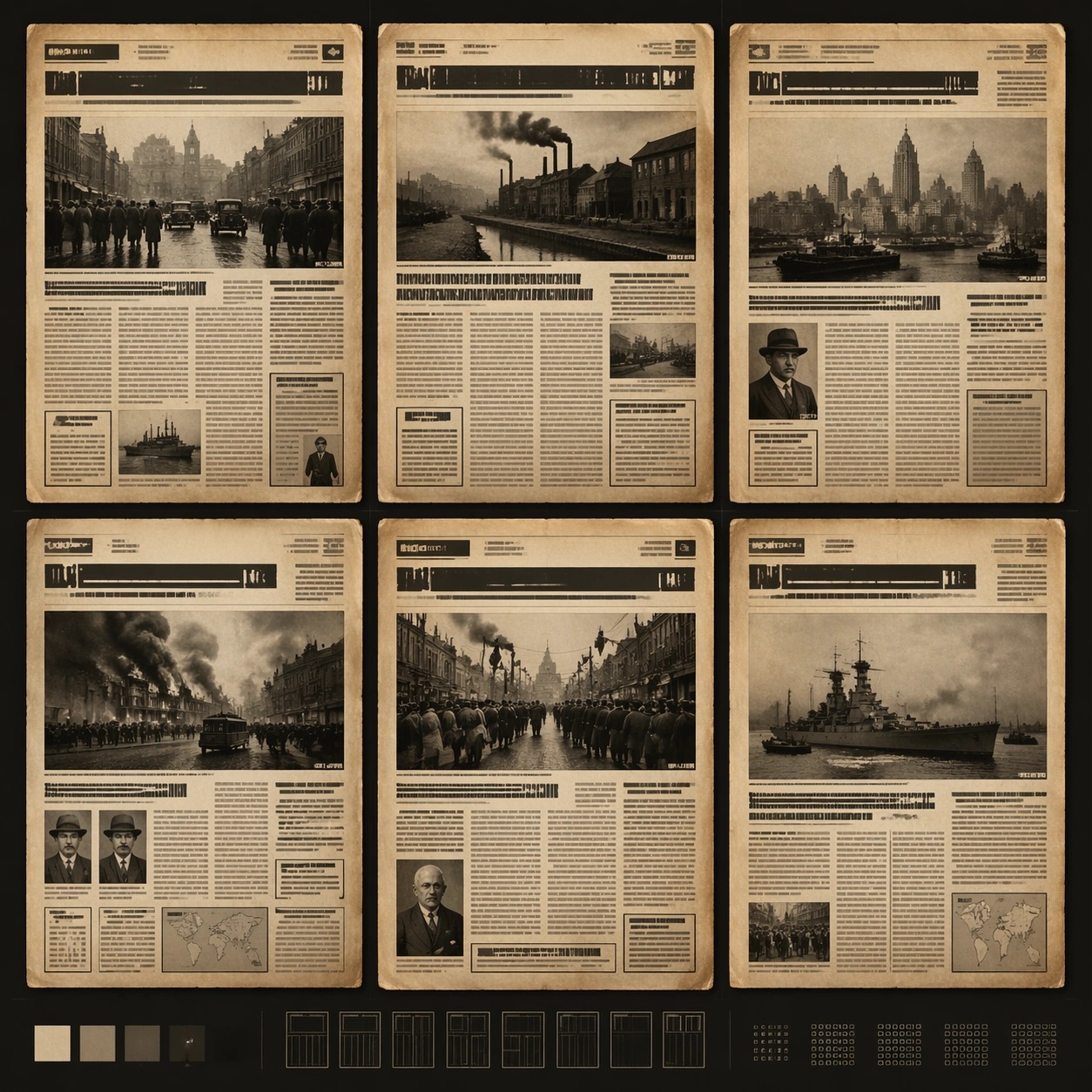
变体网格:围绕 1920s 老报纸头版 的独立单图研究,强调该变体的关键视觉控制点。
作品信息
风格标签
提示词原文英文,可直接复制使用
Scene:
A square editorial or interface layout study with exact margins, confident grid structure, and premium print or screen presentation. Build the frame around multiple aligned variations sharing one disciplined layout system. Keep the lighting, camera distance, and spatial organization tuned for a high-signal research image rather than a casual snapshot. The image belongs to the Old Newspaper Front Page theme and should feel immediately legible as a prompt atlas theme for old newspaper front page, testing text-rendering, structured-layout, commercial-mockup with gpt image 2..

Subject:
Center the study on multiple aligned variations sharing one disciplined layout system. Translate the theme into a concrete visual statement instead of an abstract mood board: the viewer should understand what kind of image this is, what is being tested, and why the composition is difficult. Use the slug idea of old newspaper front page as a literal guide for subject matter, materials, and staging.

Important details:
Typography fields must stay unreadable, but hierarchy, rhythm, and page architecture should feel convincing enough for design review. Preserve a disciplined square composition, clear focal hierarchy, and enough secondary information to make the image feel complete rather than underspecified. The image should look polished, novel, and exhibition-ready, with topic-specific credibility coming from the way surfaces, structure, and visual language reinforce Old Newspaper Front Page. Avoid generic filler elements that do not serve the main concept.

Use case:
Old Newspaper Front Page single study 2/8, testing text-rendering, structured-layout, commercial-mockup through the variant grid variation.

Constraints:
No readable text, no watermark, no logos, preserve exact 1:1 aspect ratio, no readable text, no logo lockups from real brands, no broken grid, no arbitrary poster clutter, no malformed columns, no accidental lorem ipsum.