到达休憩锚点
Arrival Lounge Anchor
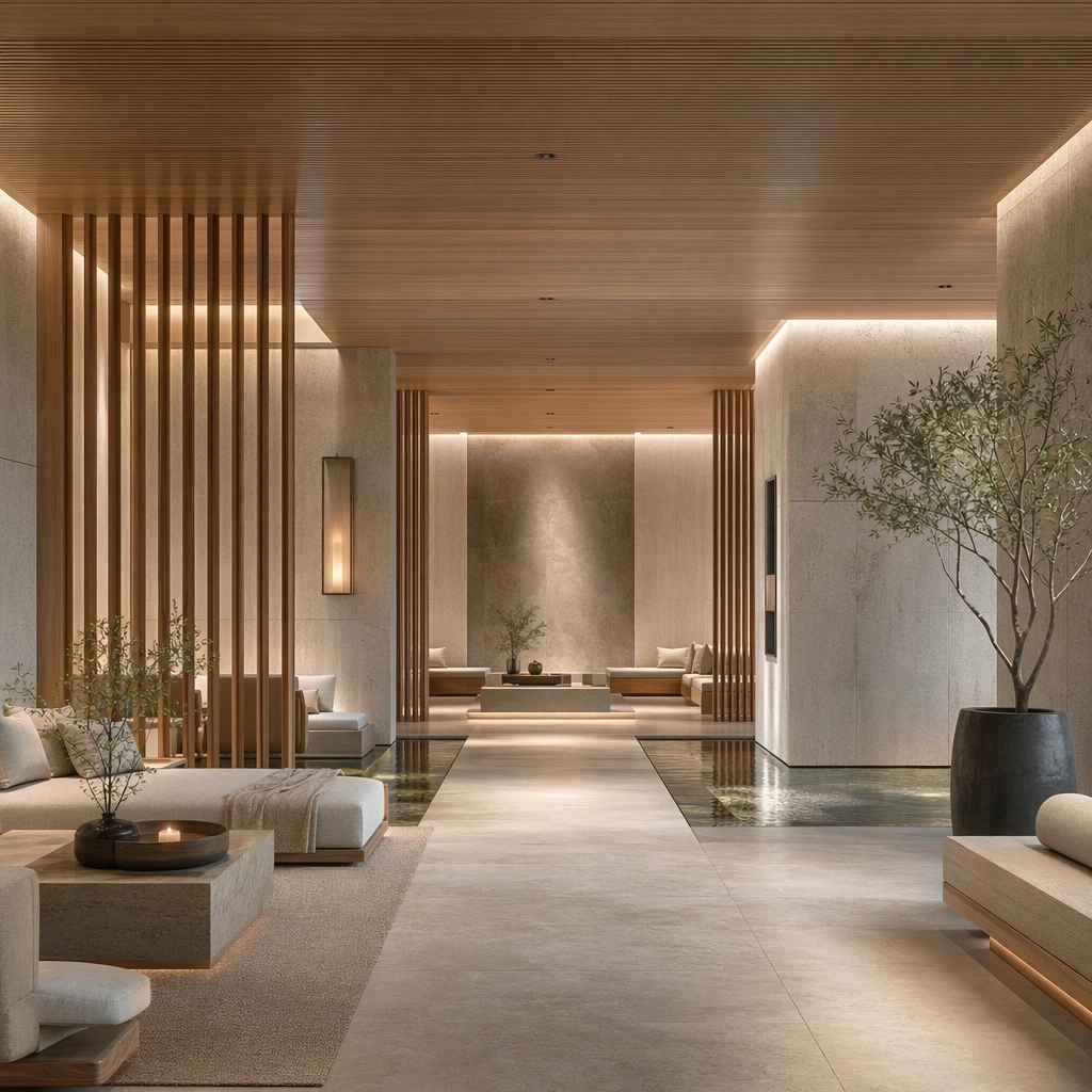
围绕疗愈空间的到达休憩锚点研究图。
作品信息
风格标签
提示词原文英文,可直接复制使用
Scene:
Create a square architectural reference still for Wellness Spa Retreat Interior Language. Use a wide still of the retreat arrival lounge with water feature and layered seating and treat the frame like a premium interior or architecture editorial photograph with disciplined perspective, readable depth from foreground to background, and enough negative space for the spatial hierarchy to breathe. Light the scene so water, stone, wood, and restorative quiet feel immediate, using pale stone, oat linen, soft oak, warm steam gray, and muted mineral green as the governing tonal range. The composition must read as a high-end commercial image that could sit inside wellness campaigns, resort editorials, treatment-menu visuals, and concept decks.

Subject:
Show a wellness retreat interior with pale oak slats, honed limestone, still water channels, linen drapery, brushed metal details, and a low-stimulation atmosphere. Center the primary wellness arrival composition, tactile materials, and hushed atmosphere. This is the canonical reference image for the package, so the major proportions, material transitions, fixture families, and circulation logic must feel highly specific and internally coherent rather than generic luxury styling. Let the viewer understand how the space is organized within a single glance, with foreground anchors, a clear middle zone, and a resolved background termination.

Important details:
Lock the oak-and-stone material pairing, water reflections, linen softness, hidden lighting, and slow, restorative spatial rhythm. Surfaces should feel tactile and believable: stone veining must stay plausible, metals should have disciplined reflectance, fabrics should show natural weight, and concealed lighting should shape the volume instead of flattening it. Use abstract signage, menu, label, or caption zones only as unreadable graphic hints. The image should feel practical for downstream design reviews and polished enough for public-facing campaign use.

Use case:
Wellness Spa Retreat Interior Language series study 1/9, establishing the canonical retreat identity for the series.

Constraints:
No readable text, no watermark, no logos, preserve exact 1:1 aspect ratio, no crowded resort guests, no tropical cliché overload, no neon wellness signs, no beauty-product branding, no chaotic reflections, no reception desk clutter.