灯箱候车亭
Transit Lightbox
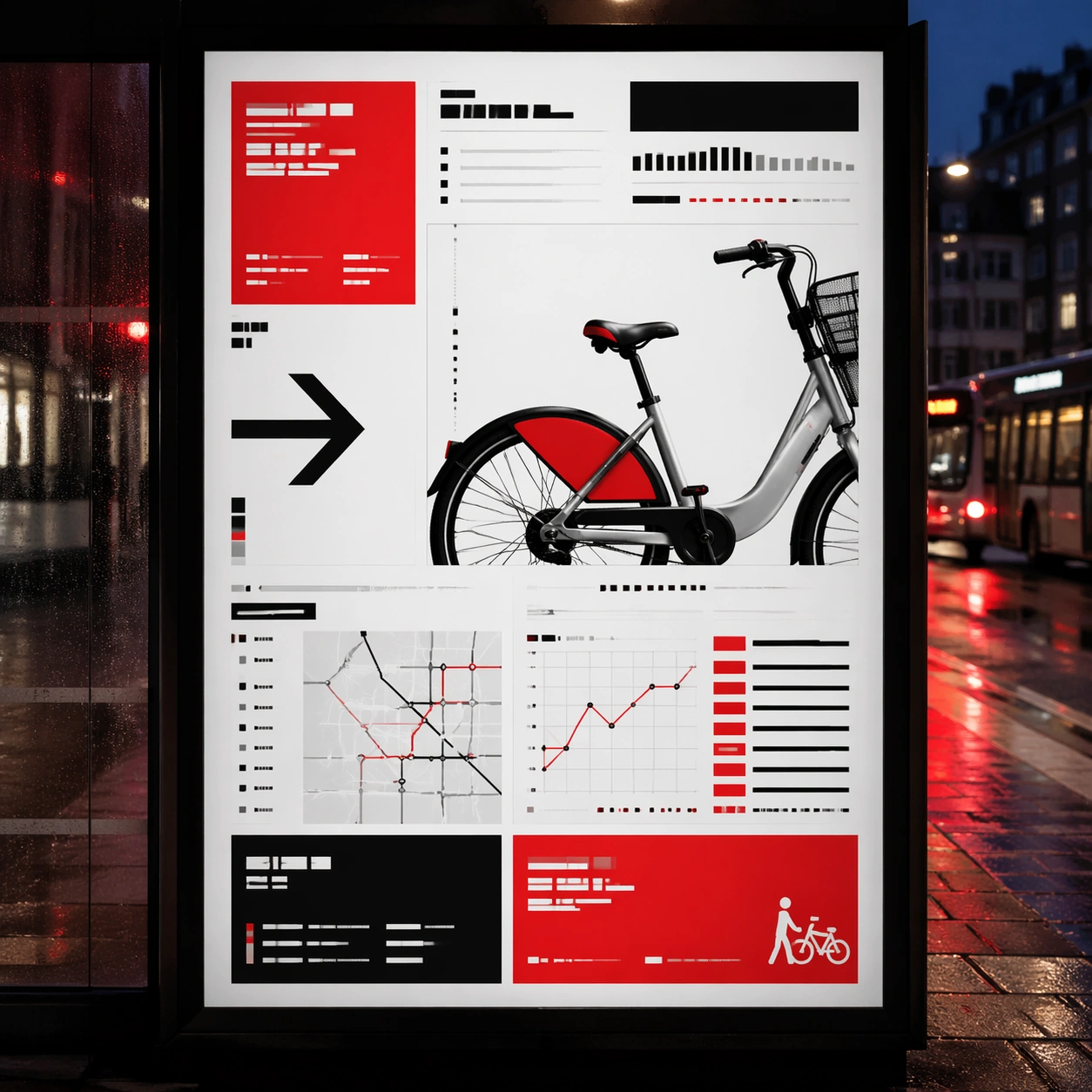
瑞士网格主题下的灯箱候车亭研究,重点是测试公共场景下的远距识别。
作品信息
风格标签
提示词原文英文,可直接复制使用
Scene:
A square dusk street photograph of a backlit transit poster glowing inside glass, with faint rain reflections, soft city blur in the distance, and the poster remaining fully legible as a composition. The poster should express rigorous Swiss grid design with modular columns, disciplined margins, quiet asymmetry, and large white fields, using red, black, white, graphite gray, and occasional cool silver paper tone and a tactile surface appropriate to the medium.

Subject:
Adapt the poster into a public-facing lightbox version that still honors the original style grammar while feeling bold enough to stop a passerby from several meters away. Use gallery objects, arrows, cropped still-life fragments, line charts, timetable bars, and alignment guides as the main visual ingredients, and organize them with grotesk typographic blocks, rules, and index markers rendered as non-readable layout forms. For the contemporary-subject axis, thread in shared bicycles, transit maps, and civic information cues reduced into a severe exhibition grid. The poster must feel like an original design object rather than a reproduction of any known work.

Important details:
Let the style survive the illumination test: color blocking, silhouette contrast, and abstract lettering should stay controlled under bright internal light and reflective glass. Preserve baseline precision, invisible column logic, severe spacing discipline, and crisp edge hierarchy. Keep every letterform abstract and non-readable, as if it were a typographic texture rather than language. Make the style unmistakable through composition, palette, surface behavior, and symbolic compression. no centered symmetry, no distressed paper, no decorative ornament, no playful doodles.

Use case:
Swiss Grid single study 3/9, testing distance readability in public display.

Constraints:
No readable text, no watermark, no logos, preserve exact 1:1 aspect ratio, no copyrighted characters, no real brand marks, no QR codes, no interface chrome, no accidental gibberish lettering.