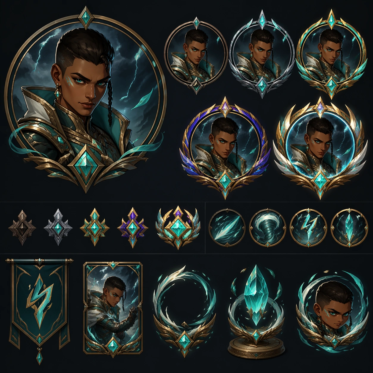
Icon Frame Board
A support study showing how portrait crops, rarity frames, and reward icons align with the same skinline identity.
作品信息
风格标签
提示词原文英文,可直接复制使用
Scene:
Compose a neat approval-board layout with circular or shield-like portrait crops, frame variations, and token-sized reward objects arranged on a clean dark field. Build a polished game-art presentation for one original playable hero skinline, with premium lighting, clean silhouette read, and merchandising clarity. Keep the image square, polished, and intentionally staged like a production-ready game asset review or campaign module. The camera, lighting, and tonal range should help the subject stay readable at both thumbnail and full resolution, with clear hierarchy and no dependence on readable on-screen copy.

Subject:
Use close portrait crops of the same hero plus a family of rarity frame treatments, small badge motifs, and cosmetic token art that all derive from the main skinline. The recurring hero is a swift storm duelist with warm brown skin, a sharp oval face, close-cropped dark hair with one longer braided strand, teal eyes, and a lean athletic build. The subject should feel original, specific, and part of one coherent product system rather than a generic fantasy or sci-fi mashup. Preserve stable design anchors, clean shape language, and believable scale relationships across every visible object, character, card, or environment layer.

Important details:
The image should bridge hero art and UI utility. Frame silhouettes, gem colors, and material accents must echo the costume system rather than feeling unrelated. The design language should show a believable rarity ladder instead of random costume swaps, keeping the same role fantasy while materials, trim density, glow treatment, and ceremonial value scale upward. Favor disciplined composition, premium material rendering, and obvious internal logic so the result feels useful for art direction, live-ops rollout, or product review. Abstract interface blocks, symbolic markers, or decorative framing are fine, but they must remain non-readable and subordinate to the main visual message.

Use case:
Skinline Suite single study 7/9, a portrait-frame and reward-support study.

Constraints:
No readable text, no watermark, no logos, preserve exact 1:1 aspect ratio, no weapon copied from known franchises, no floating price text, no random extra characters, no unreadable clutter, no readable badge numbers, no different face per crop, no generic mobile-game clutter.