折痕档案版
Folded Archive Copy
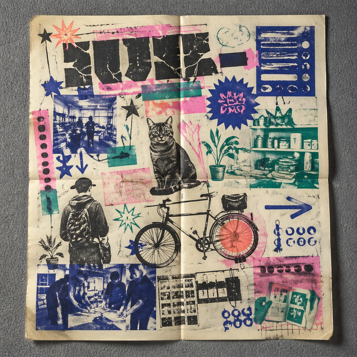
Risograph 海报主题下的折痕档案版研究,重点是测试档案保存后的时间感。
作品信息
风格标签
提示词原文英文,可直接复制使用
Scene:
A square conservation-table view of a vintage poster laid on gray felt under raking light, with visible fold lines, softened corners, and subtle aging that still preserves the integrity of the image. The poster should express DIY risograph poster language with fluorescent layers, halftone dots, soy-ink soak, copier artifacts, and handmade zine rhythm, using fluorescent pink, teal, ultramarine, black, and fibrous cream paper and a tactile surface appropriate to the medium.

Subject:
Present the poster as an archive copy that has been stored, unfolded, and carefully documented, letting age and handling reveal how the design holds up across time. Use club-flyer stars, bicycles, cats, plants, arrows, sticker bursts, notebook doodles, and photocopy shadows as the main visual ingredients, and organize them with xerox-like title blocks, stickers, and captions treated as energetic but non-readable print texture. For the contemporary-subject axis, thread in community workshops, late-night print studios, and messenger bikes folded into a zine-launch poster system. The poster must feel like an original design object rather than a reproduction of any known work.

Important details:
Aging must stay believable rather than theatrical: slight yellowing, fold memory, edge wear, and pigment variation should support the historical or crafted feeling of the style. Preserve plate drift, dot grain, bleed-through, paper curl, and independent-publisher roughness. Keep every letterform abstract and non-readable, as if it were a typographic texture rather than language. Make the style unmistakable through composition, palette, surface behavior, and symbolic compression. no full-CMYK smoothness, no perfect vector edges, no glossy magazine finish, no sterile product polish.

Use case:
Risograph Zine single study 5/9, testing archival endurance and age character.

Constraints:
No readable text, no watermark, no logos, preserve exact 1:1 aspect ratio, no copyrighted characters, no real brand marks, no QR codes, no interface chrome, no accidental gibberish lettering.