基准阵容海报
Reference Lineup Poster
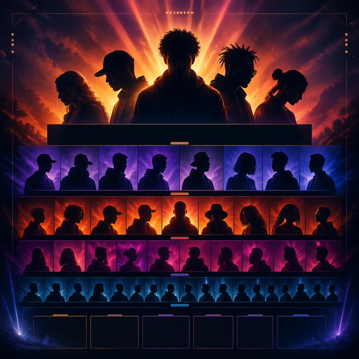
基准阵容海报,用于音乐节lineup主题的图像研究。
作品信息
风格标签
提示词原文英文,可直接复制使用
Scene:
A square festival lineup poster with a dramatic dusk-to-night atmosphere, layered haze, and broad stage-light color washing behind a stack of performer silhouettes. The composition should feel like a serious launch poster that can scale into social cutdowns, with clear tiering and modular zones for headliners, mid-tier acts, and support acts rendered as abstract non-readable bands.

Subject:
The subject is the full lineup hierarchy itself: multiple performer silhouettes and portrait fragments arranged in tiers, one strong top line, then progressively smaller supporting layers, all anchored by a believable festival atmosphere. This root image must lock the exact hierarchy logic, color palette, panel spacing, and artist-stack behavior for the rest of the rollout.

Important details:
Treat the festival as contemporary and premium rather than retro poster pastiche. Use layered depth, restrained glow, and subtle crowd-energy implication without showing a literal sea of people. The stacked lineup should feel instantly scannable and social-ready, with enough empty module space to support future day splits and crop changes.

Use case:
Festival Lineup series study 1/9 for the Festival Lineup Poster and Social Kit Prompt Atlas theme.

Constraints:
No readable text, no watermark, no logos, preserve exact 1:1 aspect ratio, no readable artist names, no sponsor logos, no giant beer branding, no literal schedule table, no crowd front row dominating the frame