Team Grid Service Page
医生个人页主题中的Team Grid Service Page图像研究。
作品信息
风格标签
提示词原文英文,可直接复制使用
Scene:
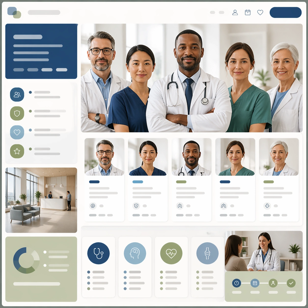
A square team profile layout board for Doctor Profile and Service Page Kit. Compose it as a square page mockup with multiple portrait tiles, hierarchy panels, and service blocks. Use a palette of soft ivory, steel blue, sage green, gentle charcoal, and warm skin tones, controlled studio-window lighting with soft falloff, and a mood of competent, human, and reassuring. The frame should feel like a real healthcare communication asset art-directed for professional delivery, not a stock photo, speculative concept render, or generic corporate template. Keep the camera distance, negative space, and depth cues disciplined so the image reads immediately even at thumbnail size.

Subject:
Center on a group of clinician headshots, expertise modules, appointment states, and supporting clinic imagery arranged into a coherent service page. Show enough surrounding context that the viewer understands the intended service surface, user situation, and institutional setting. Every object, person, diagram, device crop, or spatial cue should support clarity, trust, and practical use. If people appear, keep them anonymous, natural, privacy-safe, and grounded in believable body language rather than promotional posing.

Important details:
Maintain doctor-led service communication built from honest portraiture, clean layout structure, service cues, and restrained editorial polish. Use placeholder microcopy bars and icon slots to suggest web structure while keeping the layout human and credible. Use abstract icon shapes, color blocks, chart bars, interface modules, or non-legible placeholder microcopy whenever information structure is needed, but never readable text. Materials, spacing, lighting, and hierarchy should feel production-ready and healthcare-specific. Avoid generic lifestyle filler, decorative noise, or design gestures that do not reinforce the communication goal.

Use case:
Doctor Profile single study 2/9 for a multidisciplinary team service page.

Constraints:
No readable text, no watermark, no logos, preserve exact 1:1 aspect ratio, no celebrity likeness, no over-retouched beauty styling, no corporate stock-photo energy, no dramatic medical crisis scenes, no unreadable tiny faces, no startup-app look.