贴纸爆发版
Sticker Burst Variant
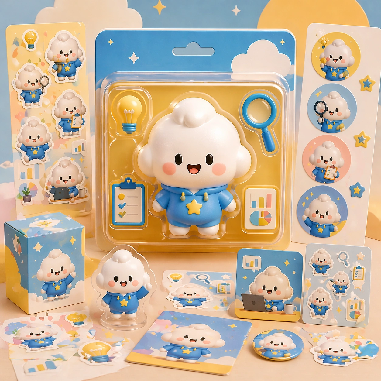
Q版说明海报 主题中的贴纸爆发版研究图。
作品信息
风格标签
提示词原文英文,可直接复制使用
Scene:
A square retail-ready campaign visual for Cute Product Explainer Poster, combining cute character appeal with polished commercial presentation. The composition should feel like a high-finish launch board: crisp packaging edges, collectible object staging, clean shelf or poster context, and vivid but controlled color. It should be immediately legible from far away, but still dense with charming small details that reward closer inspection.

Subject:
Build the image around Sticker Burst Variant, a frame that keeps the same character and package identity while adding collectible sticker energy. Translate Use chibi or mascot characters to explain complex products, workflows, or features through playful yet commercially clear explainer posters. into one lovable mascot, figure, or product system that feels ready for posters, boxes, stickers, inserts, or point-of-sale material. The result should feel like a fresh research image with clear commercial focus rather than random fan art. The main subject must remain unmistakable even when surrounded by accessories and display pieces.

Important details:
Charm alone is not enough. Preserve clean silhouette recognition, convincing package construction, reliable prop scale, and structured layout logic so the image feels sellable. This theme studies structured-layout, text-rendering, commercial-mockup, style-transfer through a production-ready visual system. Avoid noisy clutter; every secondary element should reinforce collectibility, retail desirability, or explainer clarity. Aim for clear hierarchy, polished craft, and immediately usable campaign logic.

Use case:
Cute Product Explainer Poster series study 2/4.

Constraints:
No readable text, no watermark, no logos, preserve exact 1:1 aspect ratio, no horror elements, no brand theft, no malformed packaging edges, no muddy mascot silhouette, no messy retail shelf, no chaotic prop overload.