灯箱候车亭
Transit Lightbox
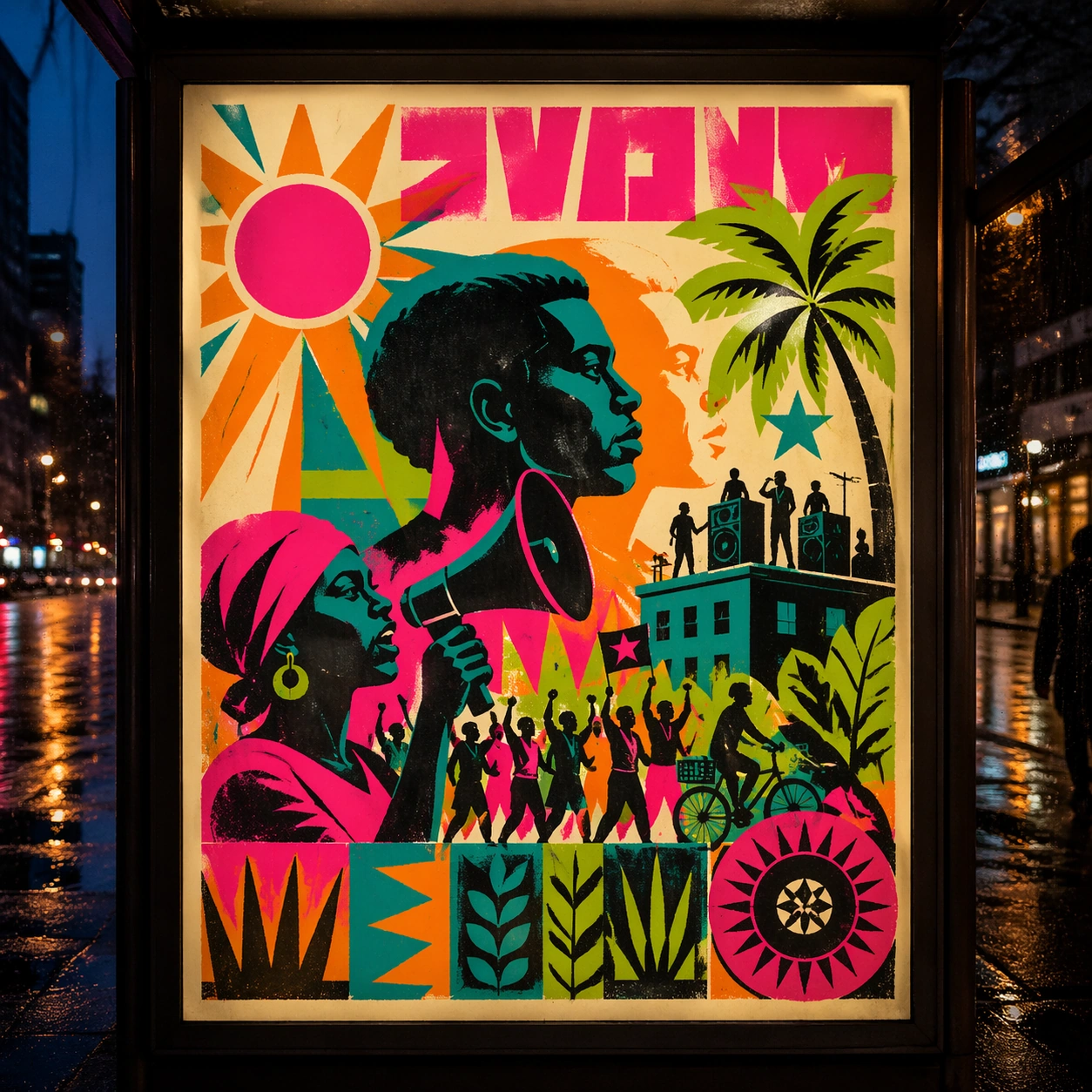
古巴丝印主题下的灯箱候车亭研究,重点是测试公共场景下的远距识别。
作品信息
风格标签
提示词原文英文,可直接复制使用
Scene:
A square dusk street photograph of a backlit transit poster glowing inside glass, with faint rain reflections, soft city blur in the distance, and the poster remaining fully legible as a composition. The poster should express 1970s Caribbean solidarity silkscreen with fluorescent flat planes, stencil edges, posterized faces, and lively registration drift, using hot pink, turquoise, lime, orange, black, and warm off-white paper and a tactile surface appropriate to the medium.

Subject:
Adapt the poster into a public-facing lightbox version that still honors the original style grammar while feeling bold enough to stop a passerby from several meters away. Use profiles, palms, sun discs, megaphones, marching silhouettes, stars, and tropical botanical shapes as the main visual ingredients, and organize them with blocky title slabs and seal-like shapes rendered as non-readable silkscreen graphics. For the contemporary-subject axis, thread in community gardens, rooftop speakers, and neighborhood bicycles absorbed into a solidarity poster language. The poster must feel like an original design object rather than a reproduction of any known work.

Important details:
Let the style survive the illumination test: color blocking, silhouette contrast, and abstract lettering should stay controlled under bright internal light and reflective glass. Preserve flat color stacking, visible plate misalignment, rough fibers, and heated tropical energy without realism. Keep every letterform abstract and non-readable, as if it were a typographic texture rather than language. Make the style unmistakable through composition, palette, surface behavior, and symbolic compression. no airbrushed realism, no corporate polish, no clean luxury gradients, no literal readable slogans.

Use case:
Cuban Silkscreen single study 3/9, testing distance readability in public display.

Constraints:
No readable text, no watermark, no logos, preserve exact 1:1 aspect ratio, no copyrighted characters, no real brand marks, no QR codes, no interface chrome, no accidental gibberish lettering.