咖啡菜单修订
Cafe Menu Revision
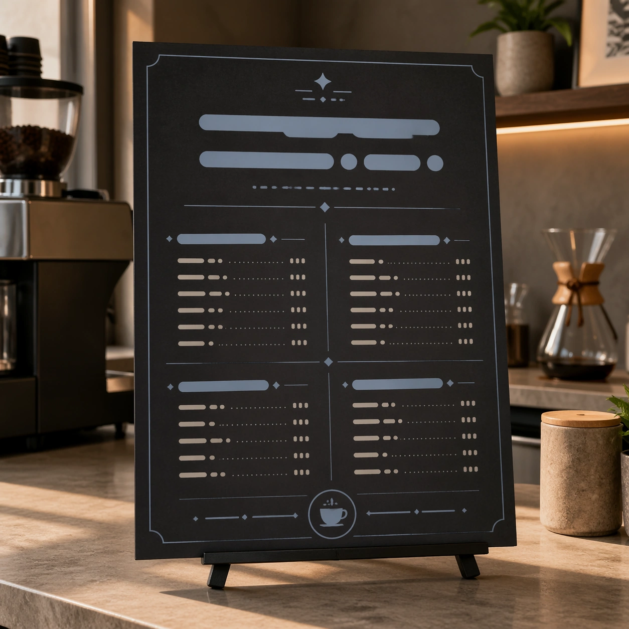
一张完成后的咖啡菜单样机,暗示多轮对话编辑但不显示编辑界面。
作品信息
风格标签
提示词原文英文,可直接复制使用
Scene:
Square crop of a cafe counter design review scene, soft morning light, neutral stone counter, and a single menu board mockup standing upright on a small easel. The image is polished commercial editorial realism with quiet shadows and precise layout. The board is not a real menu: all text areas are abstract bars, dots, and glyph-like marks.

Subject:
Show one finished menu board that visually implies several conversational edits have been applied: the background changed from bright daytime cream to a warmer evening charcoal, one left-side pastry illustration removed cleanly, the main abstract title area enlarged, and the accent color shifted cooler. Keep the menu category blocks, price-like rows made of unreadable marks, small coffee cup icon, and border grid aligned and consistent.

Important details:
The point is not a before-after split; it is the result of an edit workflow that required semantic understanding. The removed pastry area should be repaired with matching board texture and spacing. The larger heading should push nearby abstract rows downward without crowding. The cooler color should affect icons, dividers, and highlights while the cafe counter environment remains natural. The composition should feel usable by a designer evaluating whether the edit respected the original layout.

Use case:
Conversational Editing Workflow single study 5/8, testing a mask-free menu revision with object removal, hierarchy adjustment, and color tuning.

Constraints:
No readable text, no watermark, no logos, preserve exact 1:1 aspect ratio, no real cafe brand, no split-screen comparison, no UI overlay, no misspelled words, no human hands, no cluttered countertop.